Drift & Echo Gallery Website
This is a personal business venture that offers users exclusive access to pop-up galleries across London.
My goal is to create a platform for events where creative minds can connect, network and champion emerging artists while supporting local venues.
Role
UX, UI, Branding
Responsibilites
UX research, IA, Wireframing, Prototyping, Brand Development
Timeline
1.5 weeks
Understanding the Challenge
Art enthusiasts often struggle to find and book pop-up gallery events due to scattered information, inconsistent event details, and clunky booking processes. This creates missed opportunities for users to engage with emerging artists and for galleries to attract their target audiences.
A streamlined, visually engaging platform was needed to bridge this gap.
Objective
To design a user-centred platform that simplifies the discovery, exploration and booking of pop-up gallery events.
It needs to address user needs for intuitive navigation, accessible information and a frictionless booking experience.
An AI enhanced approach
Having set myself a tight project deadline, I saw an opportunity to strategically integrate AI tools at key stages of the design process.
This allowed me to accelerate tasks such as site architecture planning, ideation and image generation, while still maintaining creative control and ensuring the final output aligned with the project’s vision.
Understanding the user
From the user interviews I conducted, I identified the following pain points to address:

Understanding the competition
To establish a clear picture of the competitive landscape, I leveraged AI to quickly identify and summarise potential competitors. This provided a foundational shortlist and a set of initial insights, which I then validated and expanded through my own independent research.
This hybrid approach allowed me to speed up the discovery phase while ensuring that the audit reflected both data-driven suggestions and human-curated relevance.
Competitors Audited:
David Zwirner
Hauser & Wirth
MoMA
Sofar
Airbnb
HMWs
To help resolve the pain points, I asked some key questions:
HMW structure content in a way that highlights the most important details first?
HMW make text more readable without sacrificing the aesthetic appeal of the site?
HMW create a checkout flow that feels premium yet frictionless?
Information Architecture
I used Relume to rapidly generate the initial navigational structure of the website.
From there, I refined the structure based on hypothesised user flows, ensuring it aligned with anticipated user needs and behaviours.
Defining the core elements and purpose of each page at this early stage was invaluable - it provided a clear foundation for both design decisions and the overall user experience.

Ideation
I used Relume to generate the first draft of the wireframes. The templated modular structure really helped to quickly shape the flow of the experience. I then brought these designs into Figma and made the final adjustments.
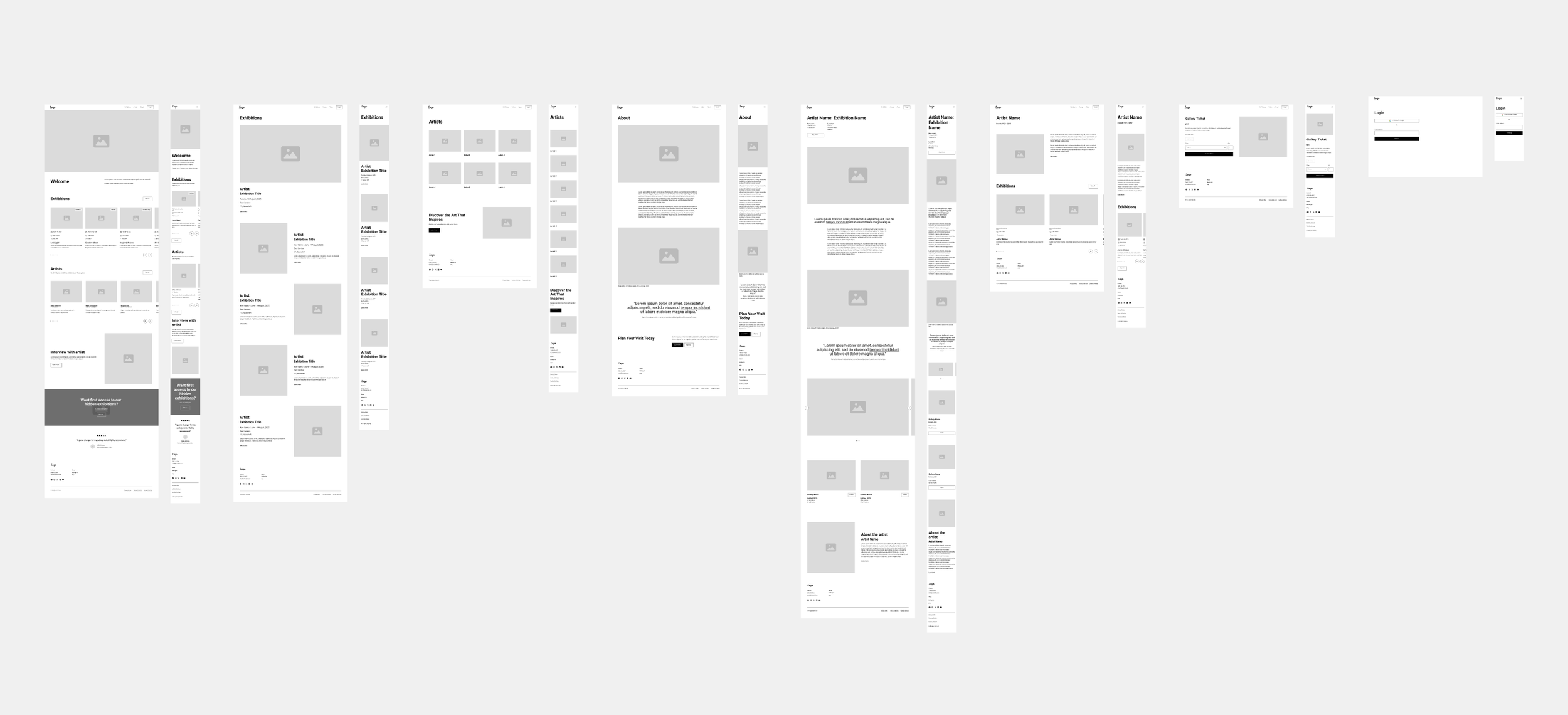
Usability testing
I created Lo-Fi Prototypes to test and validate my design decisions.
The results from testing at this stage were overall really positive, and users found the navigation and hierarchy easy to use.
The main feedback was to further streamline the number of modules and text on the pages to reduce overwhelm.
Targeted user testing
To meet my tight project deadline, I progressed directly into Hi-Fi designs, incorporating updates from the initial usability feedback.
I also made the decision to focus exclusively on the homepage design at this stage to establish the initial visual style, branding and overall look and feel.
I explored multiple layout variations and visual treatments, then conducted targeted user testing to evaluate which approaches resonated most with the audience. This allowed me to quickly identify the strongest design direction while maintaining efficiency in the process.
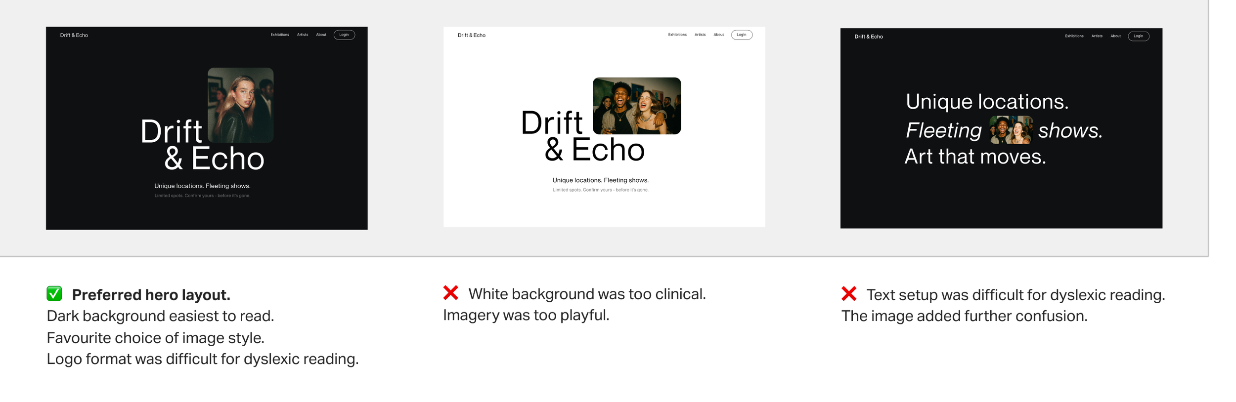
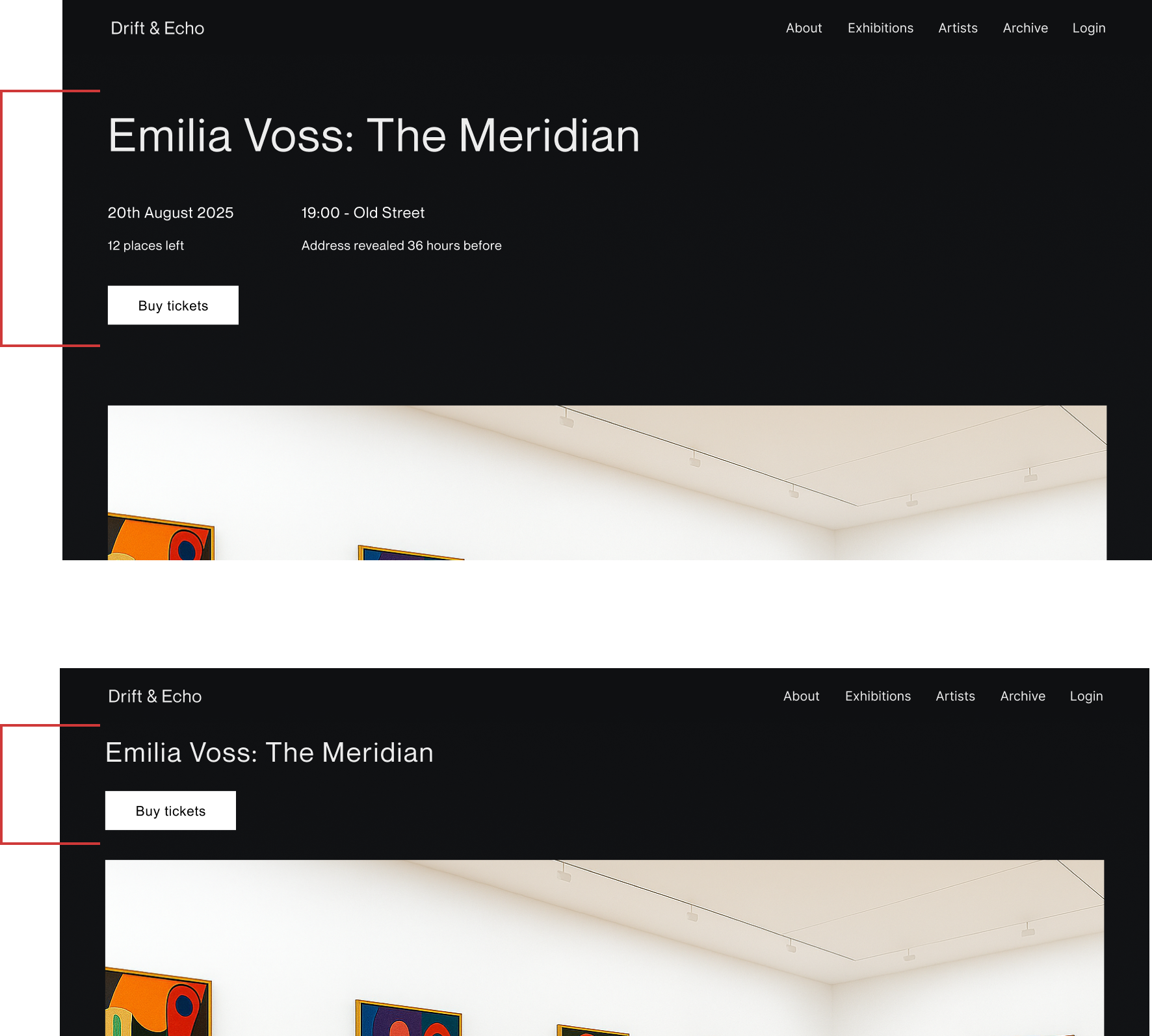
Look and Feel refinements
Following usability feedback, I implemented several key changes to the homepage to better align with user needs and the evolving brand tone:
Increased white space to create a sense of mystery, exclusivity, and improved readability.
Streamlined the hero section and simplified messaging to reduce cognitive friction and make the value proposition clearer.
Shifted the image style to be less playful, opting for a more sophisticated and refined visual approach.
Removed curved image edges to support a more serious, editorial aesthetic.
Added an Archive section to the top navigation, enabling users to explore past events and build excitement for future ones.
These refinements helped establish a cohesive, premium visual identity with the aim of improving clarity and user engagement.

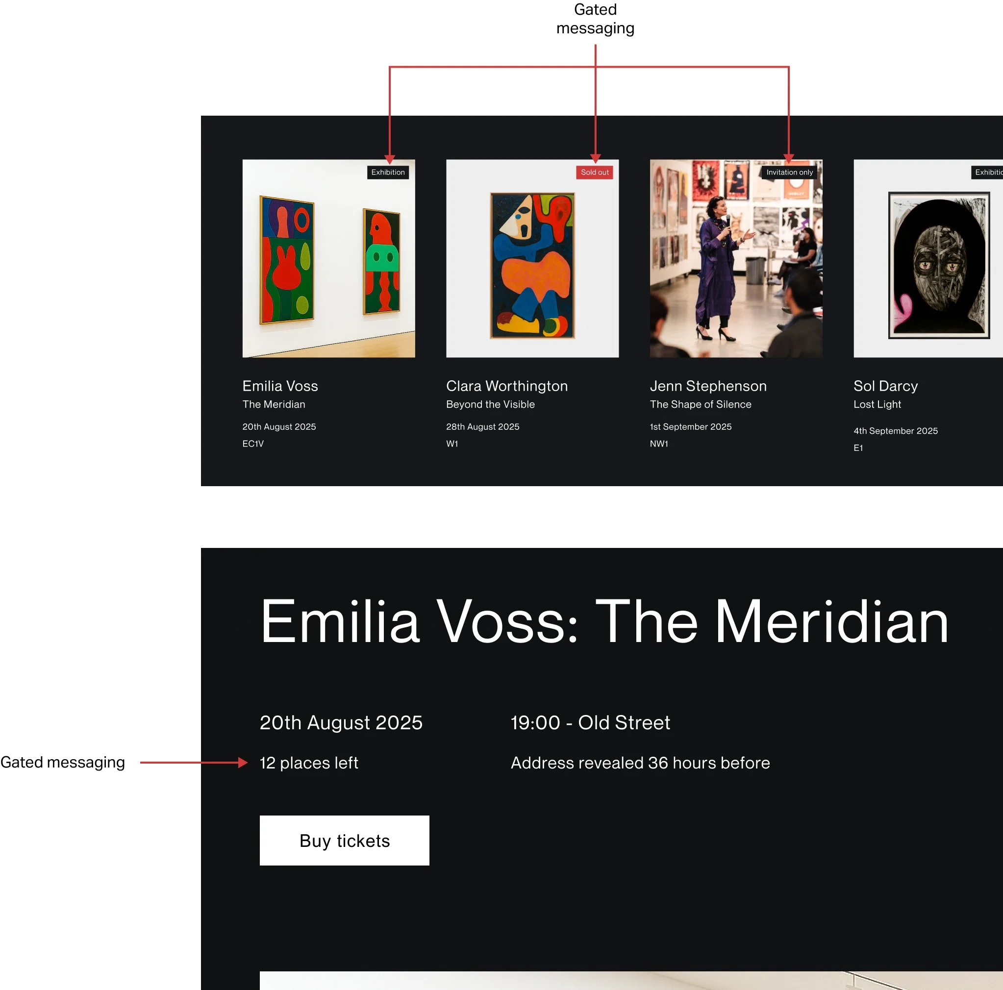
Amplifying exclusivity
The platform needed to strike a careful balance - exclusive enough to feel special, but still accessible to all.
To achieve this, I designed a layered gated approach:
Certain events would be invitation-only, reserved for select guests.
Others would be open to all, but with limited availability clearly communicated.
Scarcity was used deliberately and ethically as a design lever - for example, showing the number of places left or indicating when an event had sold out. This not only amplified the sense of exclusivity but also encouraged timely engagement without resorting to misleading tactics.
The result was an event experience that felt premium and desirable, yet transparent and fair to all users.
Sticky purchase CTAs
To streamline the booking process and reduce friction, I implemented persistent purchase call-to-actions that remain visible as the user scrolls. This ensures that ticket options and pricing are always within reach, eliminating the need to scroll back up and minimising potential drop-off points.
This approach supports continuous decision-making throughout the browsing experience, making it easier for users to act at the moment of interest.
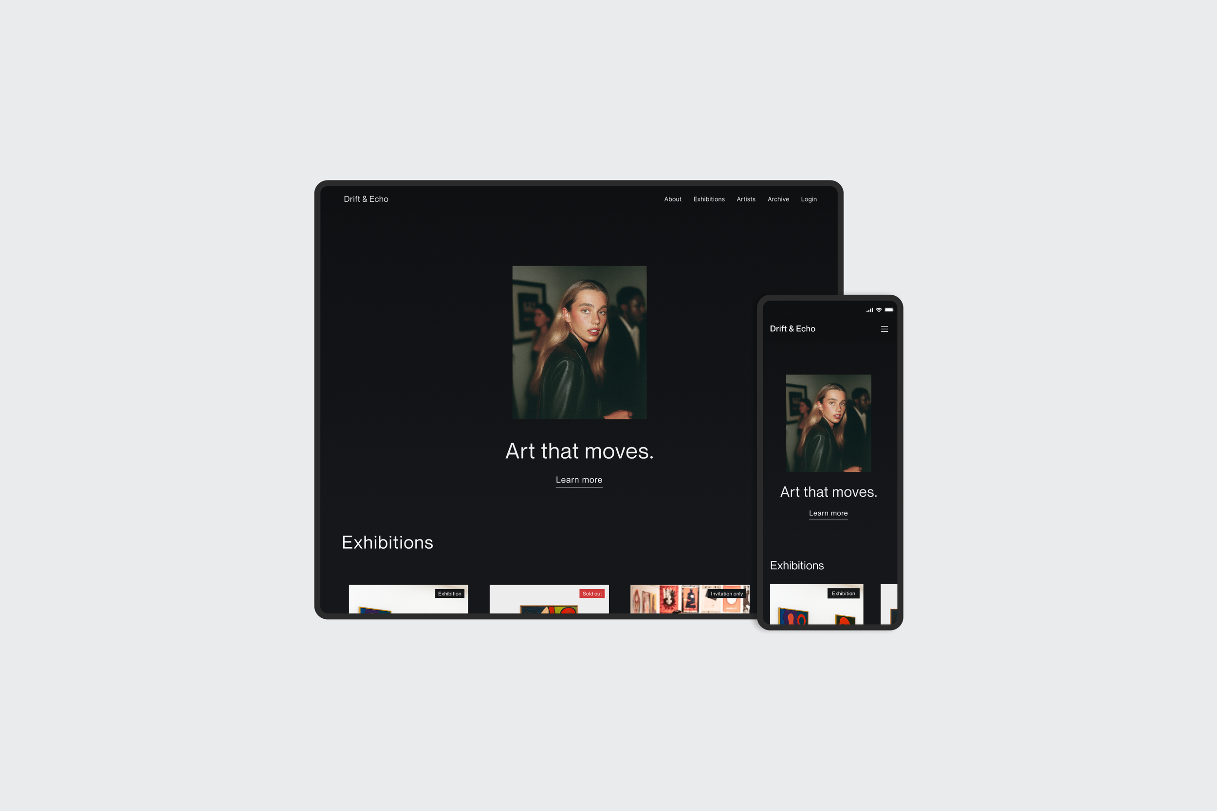
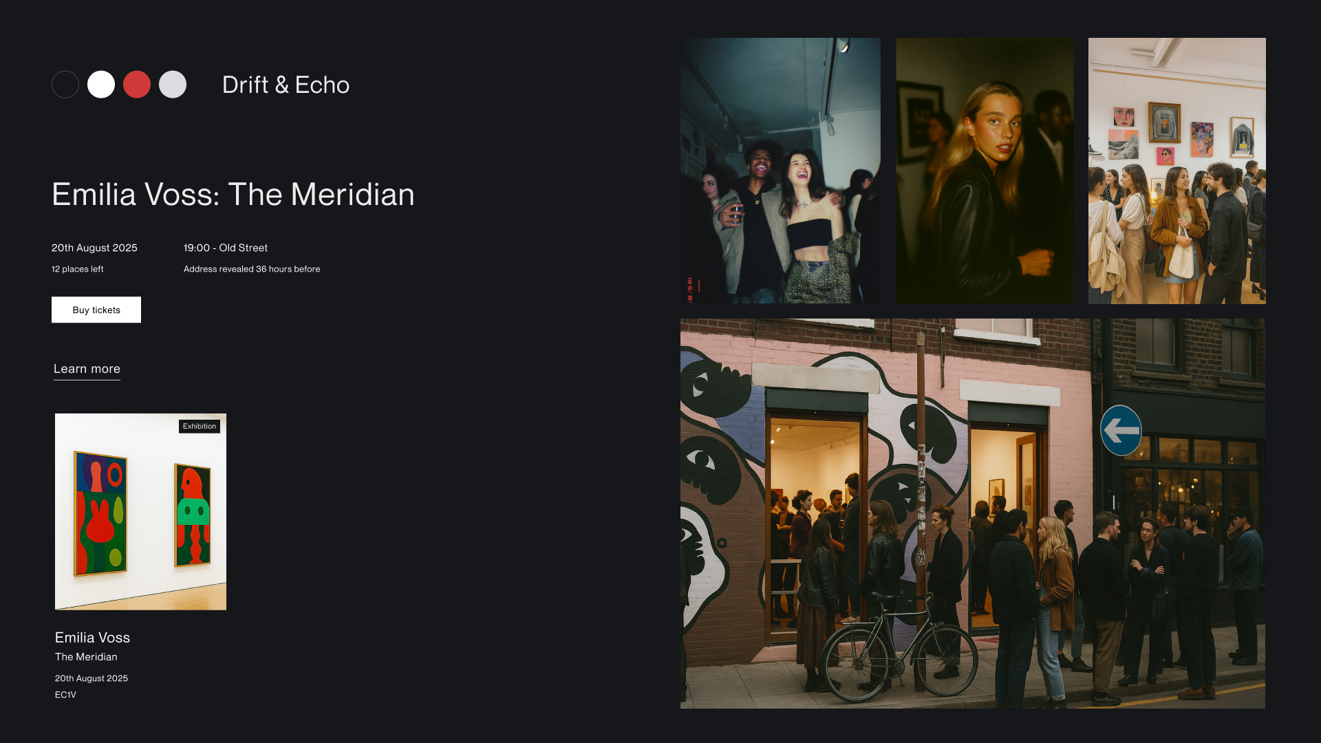
Mockups

Branding
I chose a minimalistic, brutalist-inspired design with a neutral colour palette and hard edges, ensuring WCAG accessibility compliance.
Imagery: Hard-flash, candid AI-generated photos with dark tones for mystery and exclusivity.
Typography: Neue Montreal (headings) and Arial (body) for clarity and balance.
Logo: Simple, high-end aesthetic, name developed using AI brainstorming.
The result is a brand identity that feels exclusive yet welcoming, blending editorial sophistication with authentic, in-the-moment energy.
Reflections and next steps
Phase 1 was delivered on time, validating my decision to integrate AI tools, which significantly streamlined the workflow.
I learned that under time pressure, prioritisation is essential. Delivering fewer features with excellence was more successful than spreading resources thin and compromising on quality.
The next phase will involve building out the remaining pages. A key priority will be to refine critical user interactions, particularly the ticket purchasing flow, to ensure a seamless and trustworthy experience.