Uniper Enerlytics Design System
Enerlytics was in the process of a brand refresh for its energy providing platform. This created an opportunity to bring structure and consistency to the design system supporting it.
Role
UI
Responsibilites
Visual Design, Design System, Component Library
Agency
Publicis Sapient
The Opportunity
Enerlytics needed a design foundation that could scale effectively as the platform expanded.
I worked closely with designers, the Head of UX, and the development team to evolve and maintain the design system. The focus was on bringing structure and defining standards that could support the platform long-term. This included clearly setting rules around accessibility and the introduction of dark mode.
Bringing structure to the system
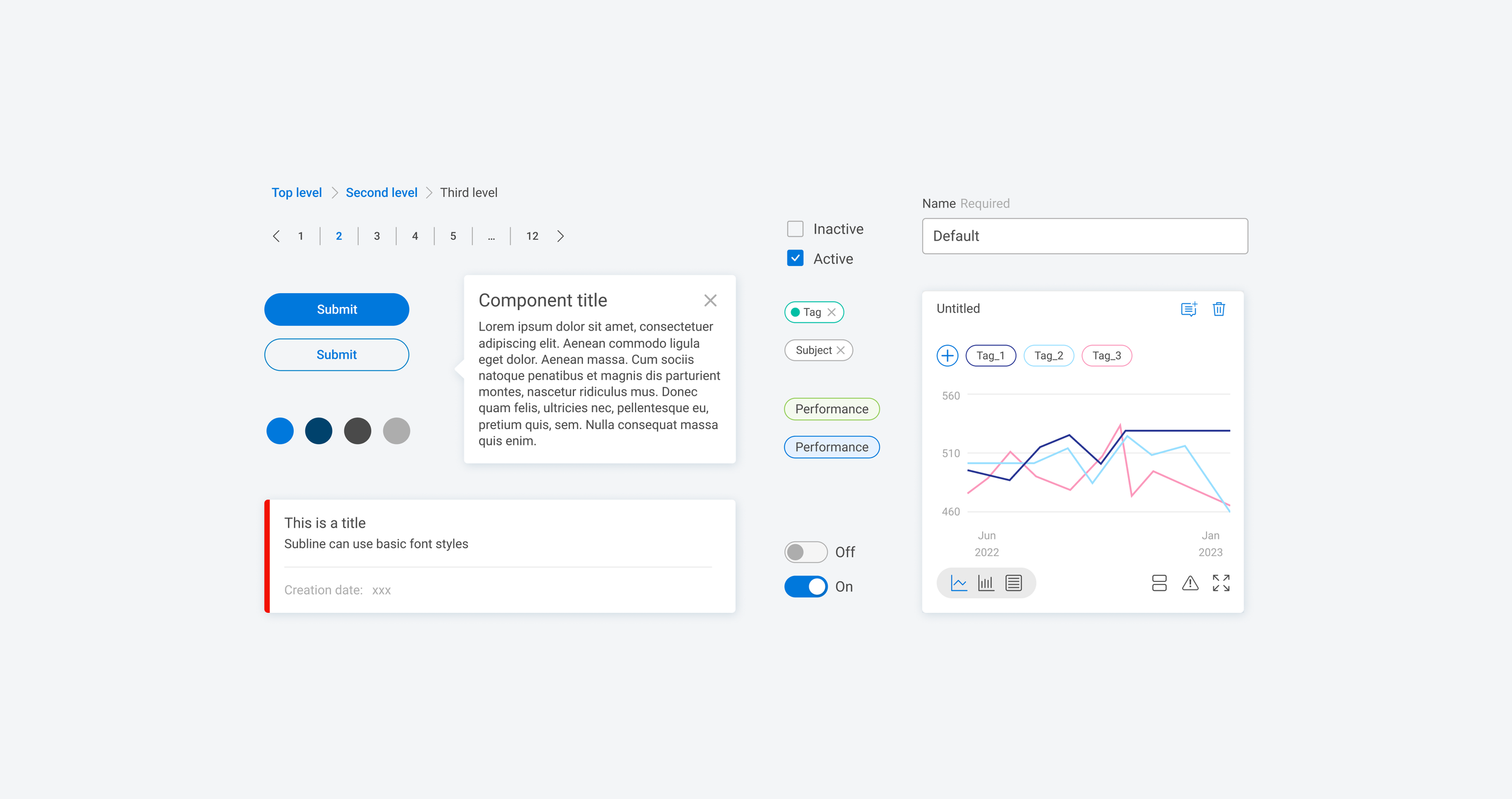
One of the first shifts was introducing a more deliberate atomic approach to how components were built.
By defining behaviour at the most fundamental level (e.g. typography, spacing and controls) we were able to compose more complex components without duplicating effort. This reduced system complexity and made it easier to scale as new features were introduced. It also gave both designers and developers a clearer understanding of how the system was structured.
To improve consistency further, I helped define a clear set of semantic design tokens, creating a shared language between design and engineering and making the system easier to evolve and maintain.
Light mode and dark mode
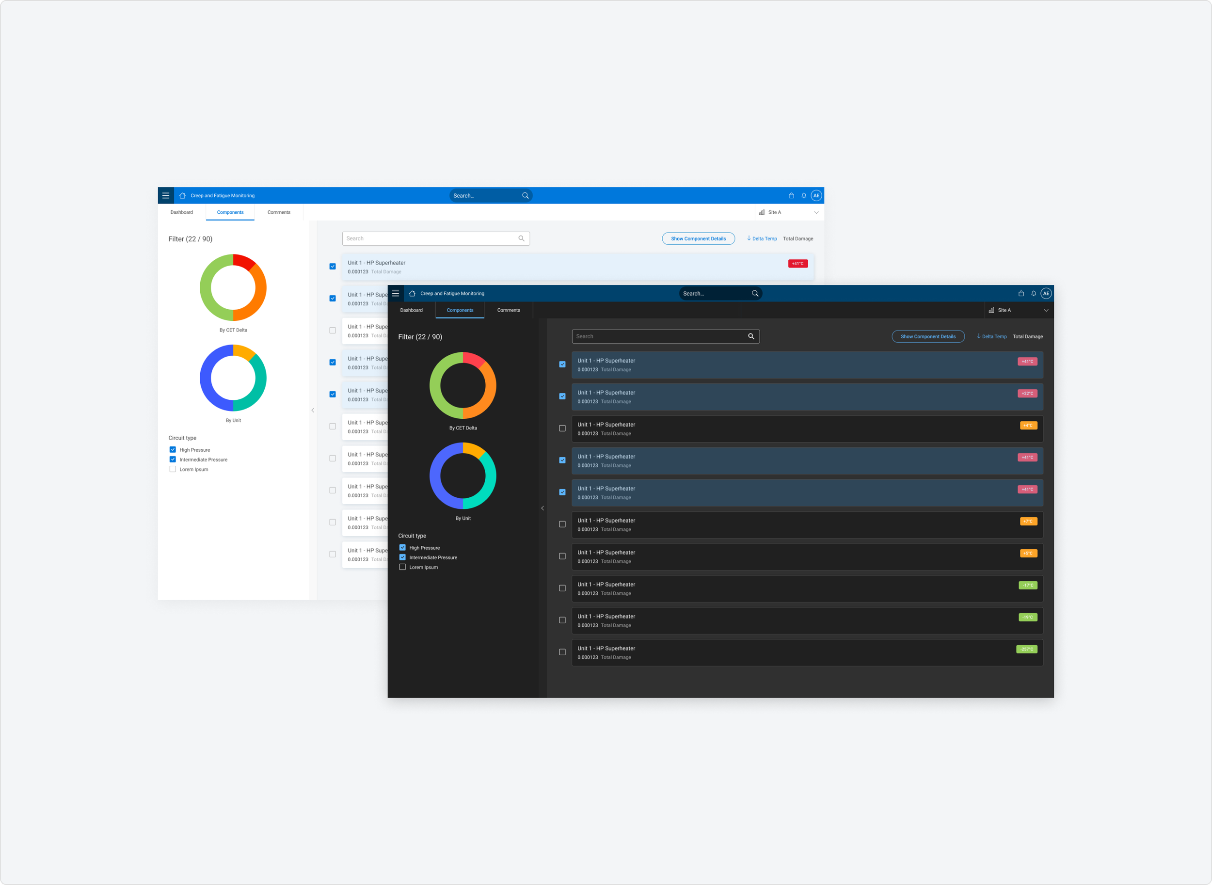
The platform originally supported light mode only, which limited usability in certain environments.
I introduced support for both light and dark modes, which required rethinking how colour, contrast, and hierarchy worked across the system.
Shadows, which were effective in light mode for distinguishing elements, became less reliable in dark mode. To address this, I placed more emphasis on colour, layering, and the use of borders to facilitate perceived separation.
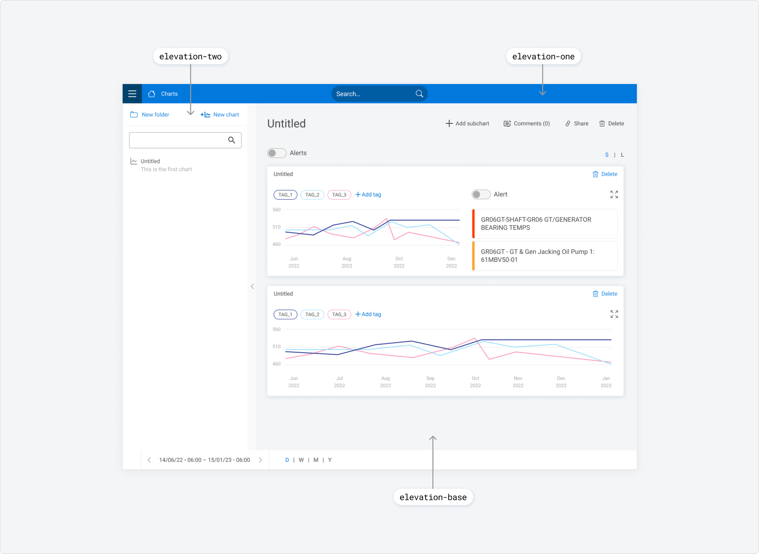
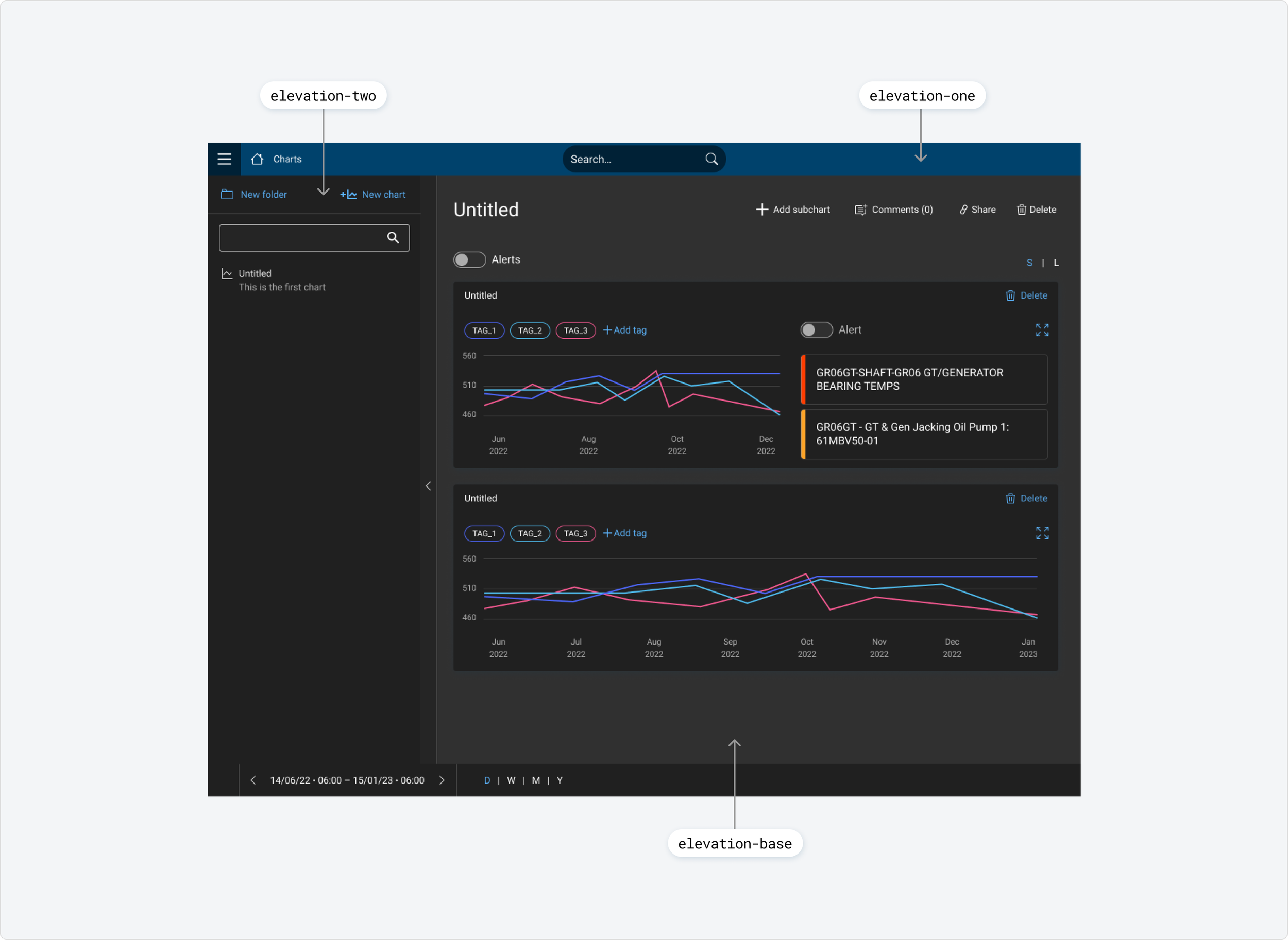
Defining rules around elevation
The development of dark mode led to the introduction of clearer rules overall around elevation - defining how surfaces relate to one another.
The base level was the main interface background (elevation-base), followed by the primary UI layer (elevation-one), with a higher layer reserved for elements such as tooltips and panels (elevation-two).
Outcome
The updated design system provided a more consistent and scalable foundation for the Enerlytics platform. Interfaces across tools became more cohesive, components were easier to reuse and extend, and teams had a clearer structure to work within. The introduction of dark mode improved usability across different environments, while more considered accessibility patterns made navigation more efficient.
Overall, the system became more efficient to work with, easier to scale, and better aligned with the needs of both the platform and the teams building it.